

Currently the default experience for Netflix.com and Chrome HTML5 video playback
Objective:
In early 2012 we (site design team @ Netflix) found opportunity to refresh our web video player. Our objectives were to:
+ maintain current functionality / minimize user retraining
+ Increase overall usability
+ Overhaul the visual aesthetic
+ Allow for touch input
+ Improve scalability
+ Eliminate legacy code
Team:
Design Manager: Skye Lee
UI + Visual: Joshua C. Harris
UI: Loretta Hui
Engineer: Robert Sweeney
Prototype Support: Matt Bruce
My Role:
+ Conceptualized + led visual design
+ Co-led user interface design
+ Led motion design
+ Wrote visual and UI spec
+ Collaborated with silverlight engineers during production
+ Aided in QA
WORK
This was the original Netflix.com video player. It worked well enough, but suffered from many interaction issues: small hit zones, no touch support, and no way of switching episodes without exiting playback, just to name a few. It wasn't that pretty either.
Concepting
We brainstormed many different directions for the new player. We focused on big ideas, 'blue-sky' concepts that would really push us, and then planned to pair down from there.

Here's an example of an early conceptual sketch of the player. I was playing with a circular progress bar to try to illustrate an idea I had; that story-lines have a cyclical quality to them as opposed to being linear. In a story you usually have stability, conflict, resolution, and then back to stability. Wouldn't it be cool to have a progress bar that reflects this cyclical quality? Since it didn't make it past the concept phase, maybe not.
Many more sketches followed, from floating players, to ones affixed to the bottom that slid up when activated, to transforming players with various modes and menus...
Early concept of the new player, I called it "Katana"; simple, precise, fatally awesome. Not awesome enough, I ditched it because it couldn't really scale once more controls were added...
For episodic playback in the "Katana" concept I wanted to play with using the whole screen to display episode selection. Ultimately I steered away from this as it seemed to heavy-handed considering full motion video would be playing in the background.
Another concept for the player called "Scroll"; ditched because it was way too complicated...too many buttons!
This concept got closer to balancing simplicity and function...
Finalizing the Concepts
After many sketches, we started to get closer to something usable. Up top we'd utilize the space to display show/movie title information, player close control, and (when viewing serial content) an episode chooser. On the bottom would be all the player controls you'd come to expect.
Wireframe layout showing movie playback
Wireframe layout showing serialized content playback w/ episode menu
A Change of Direction
Near the deadline, I realized the concept that I was finalizing, while improved over the current player, still felt like the old player and like other video players out at the time. Controls fixed at the bottom, the progress bar placement, etc. It all felt undifferentiated. My design manager (and mentor!) Skye Lee had been a fan of the 'floating player' since the beginning and so I decided to give it another try. It turned out separating the player controls from the edges of the screen allowed the content to 'breathe' and made the controls feel even more like a dismissible layer- not in the way of the content. This visual language aligned closer to our "content first" philosophy so we ran with it.
Key changes included:
- As mentioned, unpinning the controls from the bottom/top of the screen and making the UI 'float' gave everything a fresher look/feel.
- Separating the progress bar from the rest of the controls gave space for not only more controls to be added later, but also gave room for content's title and episode information to be a part of the UI. It also made scrubbing a bit easier.
- We reduced the timestamp to display only the 'time remaining' instead of showing both run-time and time into the title (usually seen like this: time into title---> 1:34:23 / 2:10:34<--- full length of title), another effort made to de-clutter the interface.
- I decided all menus would be quick tool-tip like fly-outs - making getting to controls quick and easy and non-disruptive of the content playing behind the controls
Visual Design Explorations
Ah, my favorite part of designing a UI, making it pretty! In finding the new visual style for the player I went through a lot of explorations. Here are just a few examples that led me to the final look you see today. NOTE: like my UI concepts, I like to give names to visual design concepts, bear with me.
"Tonka" - chunky, heavy, everything is touchable and grab-able. Too skeuomorphic...
"Onyx" - sleek, translucent, glass-like. Too much like QT player...
"Juice" - liquid-y, transparent, barely there. Too...invisible :)
"Inset" - What if the player felt imprinted into the content? Maybe too dramatic...
"Onyx w/fat progress" - I liked this direction, but made the progress bar more accessible. Again, too much like QT player...and other player aesthetics at the time.
"Superflat" - inspired by the superflat art of Takashi Murakami. I broke the rules and added some bevels. I guess I wasn't ready to go all the way flat yet
As mentioned above, when we decided to shoot for more of a 'floating player', I decided to separate the progress bar from the rest of the controls. It wasn't until the visual design exploration below that I actually tried to visualize what that might look like.
"Shuttle" - I decided to separate the progress bar. I liked it. As for the visual design, at this point I still felt like the UI had to have some dimensionality to feel 'touchable' hence the heavy gradients/bevel lighting. :/
Ah Ha! Moment
After all of the explorations (~30 actually) I couldn't decide on a visual style. They all just didn't feel right.
Then, I realized...
I was over-designing.
I was so focused on making a visual statement with the player's look that I lost sight of what the point of the player was: a tool that assisted the user in viewing content. It was all about the content, the player should be as subdued as possible so that the user can enjoy the movie or TV show they're watching and not be distracted by the tools.
With that in mind, I decided to go flat, clean, and 'quiet'. No loud stylish lighting effects, no textures, etc. Simple and functional.
FINAL DESIGN
We found a lot of opportunities for improvement and were able to execute on most of them considering the time allotted for the project. The final design was productized and currently serves as the primary UI for Netflix.com.
The productized redesign
Interaction Hightlights
Pause Screen
My favorite addition to the new player, the Pause Screen. I wanted to capitalize on that moment we all have: you're watching something, hit pause, and go take care of something for a couple minutes. When you return you hit play and continue watching. The Pause screen is a way to 'welcome back' the user when they return. It uses the paused video frame as a background image, and overlays the content's metadata information on top. A quick reminder to the user of what they were last doing before that much needed bathroom break.
The pause screen.
Progress Bar Focus
Designing the progress bar to 'float' above the controls gave the video player a nice aesthetic. To continue with the theme I wanted the progress bar to react to the user by moving out of the way when it was no longer the focus of the interaction. This 'push down/up' animation was the result. The progress bar always hides when a menu is activated and then re-appears when a menu is dismissed.
Scrub Nub + Trickplay
The previous 'scrub nub' was very small, hard to target, and didn't feel grab-able. I came up with a nub that would grow on cursor hover. In the active state, it 'squishes' into the progress well as the user drags the nub along to scrub through content.
Additionally, trick-play needed a revamp. The old version of the interaction took up the whole screen and unnecessarily caused a shift in context for the user. Instead, trickplay would now resolve into a simple thumbnail preview that follows the user's cursor as they hover (or click+drag) across the progress bar.

Volume Slider
The volume slider. Some nice-to-haves that I added in during development:
- expanding 'nub' - larger 'hit-zone' makes it easier to grab, animation reinforces its an affordance that can be interacted with.
- reactive speaker icon - depending on the volume level the speaker icon changes: 3 waves = 100% volume --> X = mute.

Episode Menu
My design partner, Loretta Hui, came up with this layout for a scalable episode chooser. I finalized the visual style and worked with engineering to create the animations seen when transitioning between seasons and episodes.
The Press
When we released the player, Netflix was still licking its wounds from the Qwikster incident. :)
To our surprise, many people seemed to like the player and saw it as a sign that Netflix was still focused on improving the user experience for it's customers.
Here are some of my favorite reviews, click the preview images for the full article.

Time

VentureBeat
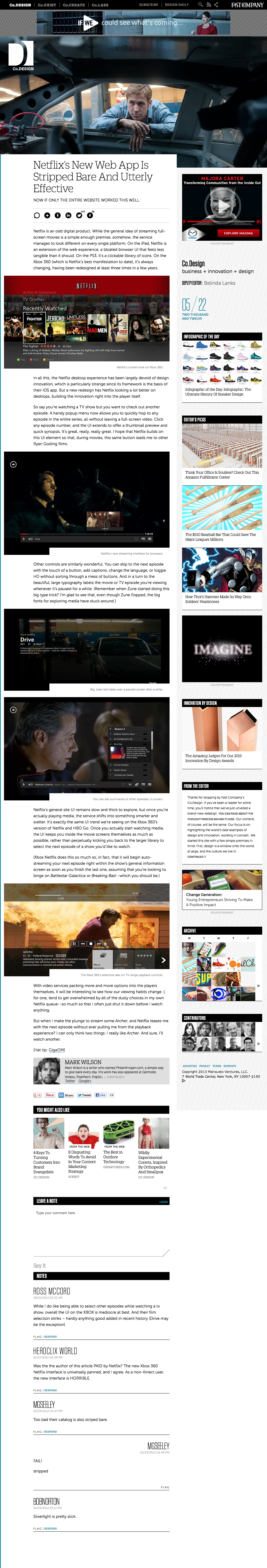
FastCo Design

BuzzFeed
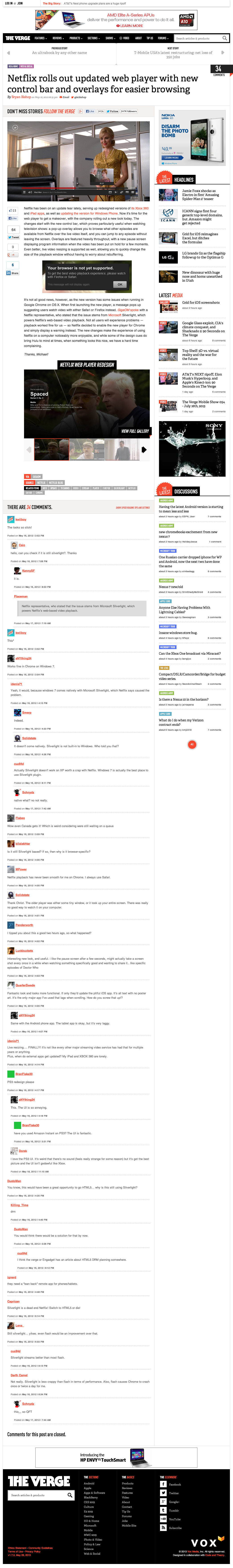
The Verge

SlashGear